How I Built a 20-City Gothic Poster Collection With AI: The Brand Rulebook
The key to a coherent 20-city AI-assisted poster collection is to lock a rulebook before generating city one: a fixed palette, layout, typography, signature and negative-prompt system. This case study shows how those constraints kept The Cartographer’s Grimoire recognizable while the city, architecture and illustration treatment changed.
Somewhere around city twelve, I realized the actual product wasn’t the poster. It was the rulebook — the part that doesn’t show up in any single listing, but decides whether the eighteenth city still feels like it belongs next to the first one.
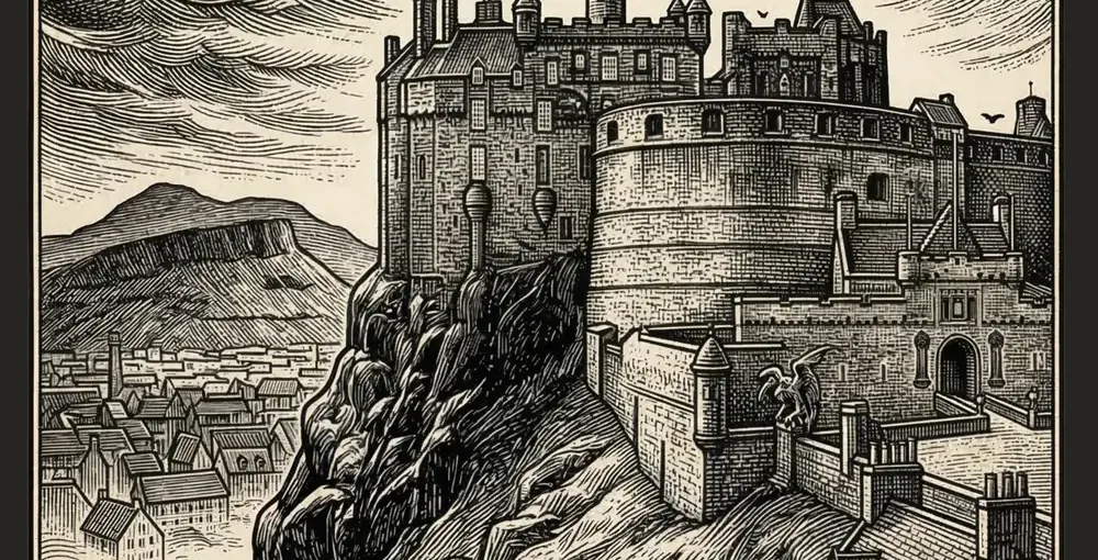
The Cartographer’s Grimoire started as one design — Edinburgh Castle, rendered as a gothic woodcut engraving, for a Dark Academia storefront under our Arcane Archives brand. Twenty cities later — Prague, Istanbul, Athens, and more — it’s a running series with its own visual identity, and the reason it still looks like one coherent thing instead of twenty unrelated posters isn’t the AI. It’s the constraints I put around it before I generated a single image.
Being Upfront About the Process
These illustrations are AI-generated, and every listing is labelled as AI-assisted where required by the upload workflow — that disclosure should not be buried in fine print. Redbubble’s Community and Content Guidelines also make clear that platform labelling does not replace a copyright or trademark review. What isn’t AI-generated is everything that makes the collection actually work: the art direction, the brand rules, the SEO copy, and the decision-making about which city goes where in the series. The tool renders an image. It doesn’t run a product line.
The Rulebook That Came Before City One
Before generating Edinburgh, I locked three things that never change between cities, regardless of style variant:
The palette. Every poster sits on the same #0D0D0D absolute black background. Gold accents are always the same antique gold (#C9A84C), cream text is always the same warm off-white (#F5F0E8). A customer who’s seen one poster from this series recognizes the next one before they’ve read the title.
The layout formula. City name at the top, illustration centered taking up 85-90% of the canvas, and a fixed “series signature” — The Cartographer’s Grimoire — centered at the bottom of every single poster. That bottom line is doing more brand work than almost anything else in the design: it’s the difference between “a gothic poster” and “a numbered piece from a collection,” which is exactly the framing that makes a customer want the next city too.
The negative-prompt discipline. Every single generation excludes the same list — no people, no modern cars, no contemporary signage, no watermarks, no text baked into the image. That’s not a style choice, it’s a consistency guarantee: it’s what stops one city from accidentally looking photographic while another looks illustrated.
Where the Style Actually Varies (And Why That’s Allowed)
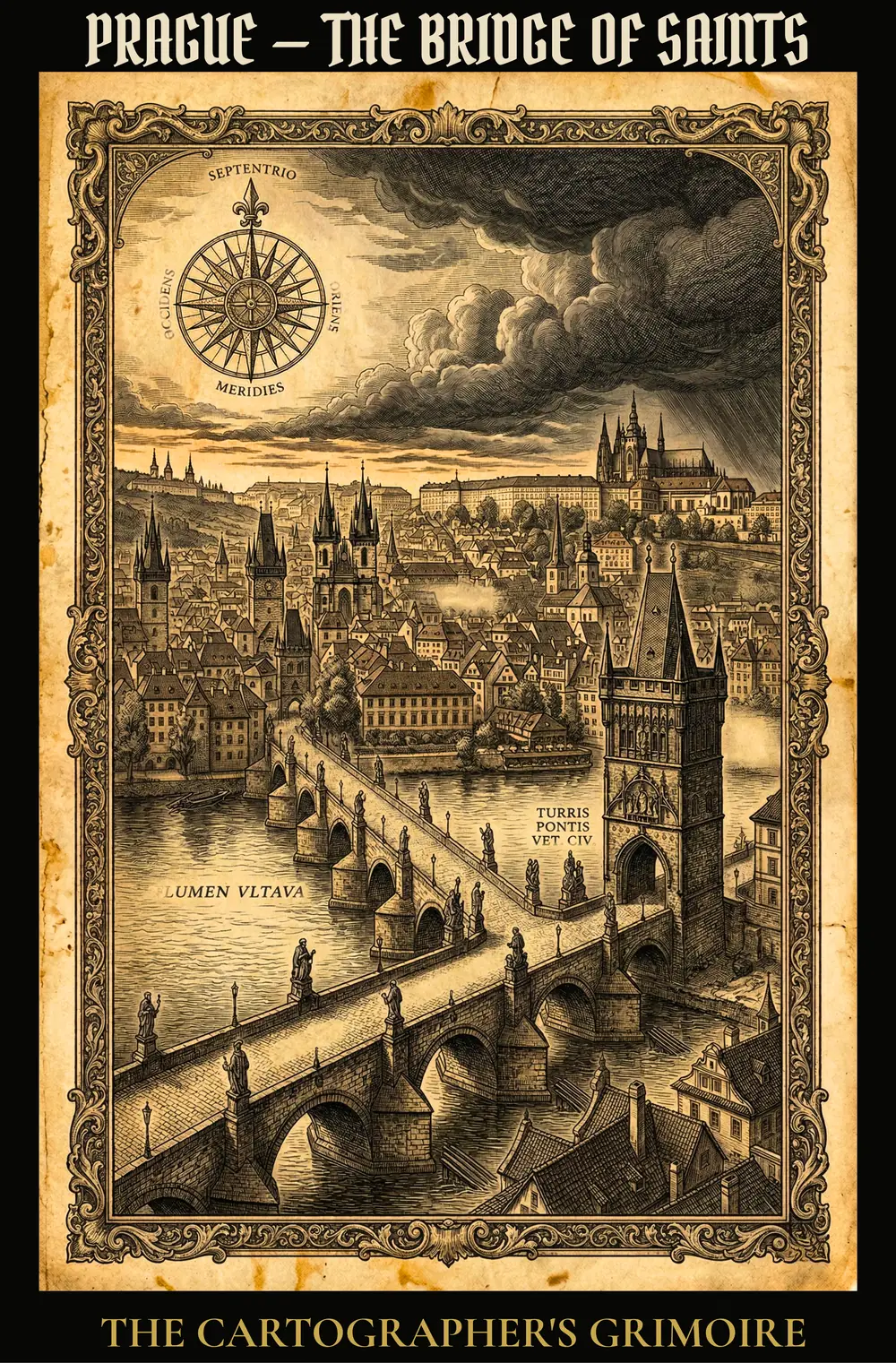
Not everything stays fixed, and that’s deliberate. Edinburgh runs in a straight black-and-white woodcut style — dense crosshatching, ink stippling, high contrast. Prague shifts to gold-linework on black, a moodier, more “illuminated manuscript” register. Athens goes further still, framed as a gothic tarot card with an ornamental border and Roman numeral, leaning into the mythological weight of the Acropolis rather than a straight architectural rendering.
That variation is what keeps twenty posters from feeling like the same image with a new label pasted on. The rule isn’t “everything looks identical” — it’s “everything shares a palette, a layout skeleton, and a signature,” while the illustration style flexes to match what each city’s actual character calls for. Rome asks for something different than Prague, and forcing them into one identical template would have flattened the exact thing that makes a themed collection interesting to collect.
The Version That Didn’t Make the Cut
Not every generation hits on the first try, and pretending otherwise would undercut the whole point of being upfront about this process. An early pass at Prague leaned too hard into the gold-linework style before the composition itself was locked — the bridge and the castle silhouette behind it fought for visual weight instead of one clearly leading the eye, and no amount of color grading was going to fix a composition problem after the fact. The fix wasn’t a better prompt with more adjectives; it was going back to the reference framing first — deciding which single element the poster is actually about — and only then layering the style choices on top. That ordering, composition before style, turned out to matter more across the whole series than any individual prompt tweak.
What City Selection Actually Looks Like
Edinburgh went first for one practical reason: its Old Town skyline and volcanic rock silhouette translate into dense woodcut crosshatching more naturally than almost anywhere else — a strong first entry sets the bar the rest of the series has to clear. From there, the sequencing followed loose regional arcs rather than a rigid list: Western Europe’s classic gothic architecture, then an Eastern European turn through Prague, then further into Istanbul and Athens as the series pushed toward the edges of what “gothic” can mean geographically. If a city’s most famous monument doesn’t photograph — or illustrate — as something moody and vertical, it doesn’t make the cut regardless of how well-known it is.
The Part That Doesn’t Scale Automatically
The one thing AI generation doesn’t solve is metadata discipline, and it’s tempting to let it slide once you’re moving fast through a series. Every one of these listings still needs its own title variant testing, its own tag set built around the specific monument and city (not just “gothic art” copy-pasted twenty times), and its own description written for that city’s actual character rather than a template with the city name swapped in. Our tag hierarchy guide covers the mechanics of that if you’re building a similar series and don’t want the SEO side to become the bottleneck once your catalog is 20 designs deep instead of one.
Getting the Collection Seen, Not Just Listed
A 20-piece series with a strong shared identity is also, not by accident, easier to distribute than 20 unrelated designs would be. Every poster in this collection feeds the same Pinterest board — “Dark Academia Gift Collection” — rather than being scattered across generic boards by product type. That matters because a visitor who pins one city is shown the rest of the series by the platform itself; the collection does some of its own marketing once enough pieces exist in one place. If you’re setting up something similar, decide the board structure before you publish city one, not after you’ve already split your own traffic across a dozen mismatched boards.
This collection lives inside the same visual system we document in our Visual Niche Blueprint — the rules that keep a brand recognizable when you scale past twenty pieces. For the SEO and tagging side of getting seen, our Redbubble 15-tag hierarchy covers the exact metadata structure we apply to every listing.
What I’d Tell Myself Before Starting
Lock the rulebook before you generate anything, not after your third design. Going back to retrofit consistent colors and layout onto designs you’ve already published is far more work than deciding it upfront — and customers notice the seam where your style changed mid-series more than you’d expect.
You can see where this landed so far in the full collection on Redbubble, starting with Edinburgh — The Old Town Citadel, the piece that set the rules everything after it had to follow.
Frequently asked questions
Are these designs AI-generated?
Yes, and we say so openly, including checking Redbubble's 'AI-assisted content' box on every upload. The prompting, art direction, brand consistency, and SEO copy are all done by hand — the image generation step is AI.
How many designs is 'too many' before a collection loses coherence?
There's no fixed number, but the risk starts the moment you stop referencing your own style rules and start improvising per design. Locking the palette, typography, and layout formula before city one is what let this scale to 20 without drifting.
Do I need a graphic design background to build a collection like this?
No, but you need a documented rulebook you actually follow. The AI handles the illustration; the discipline of sticking to fixed colors, fonts, and layout positions is what makes the output look like one brand instead of twenty random posters.
Why start a city collection with Edinburgh instead of a more famous city like Paris or Rome?
Edinburgh's Old Town skyline and volcanic rock silhouette translate unusually well into dense woodcut crosshatching — the visual style was the deciding factor, not the city's fame. Picking a strong style-fit first city set the bar for every one that followed.
More from this series